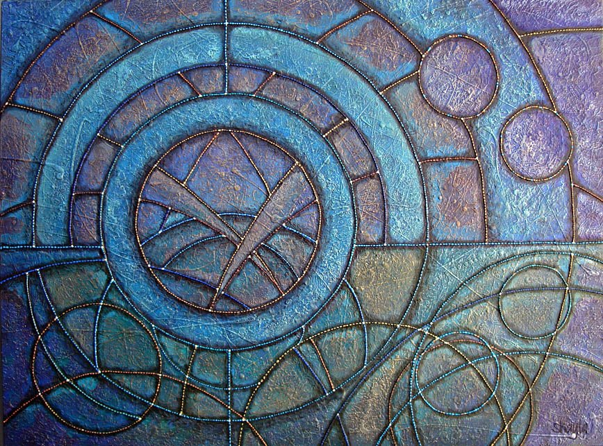
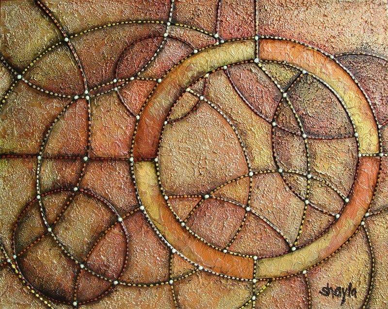


1. artificial lighting
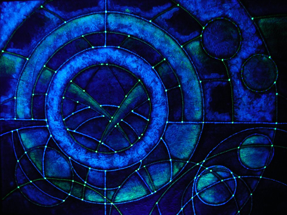
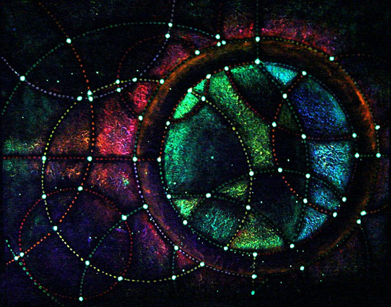
2. uv and artificial lighting combined
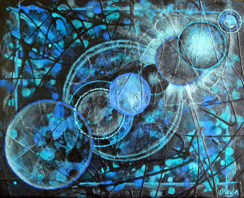
3. uv lighting only
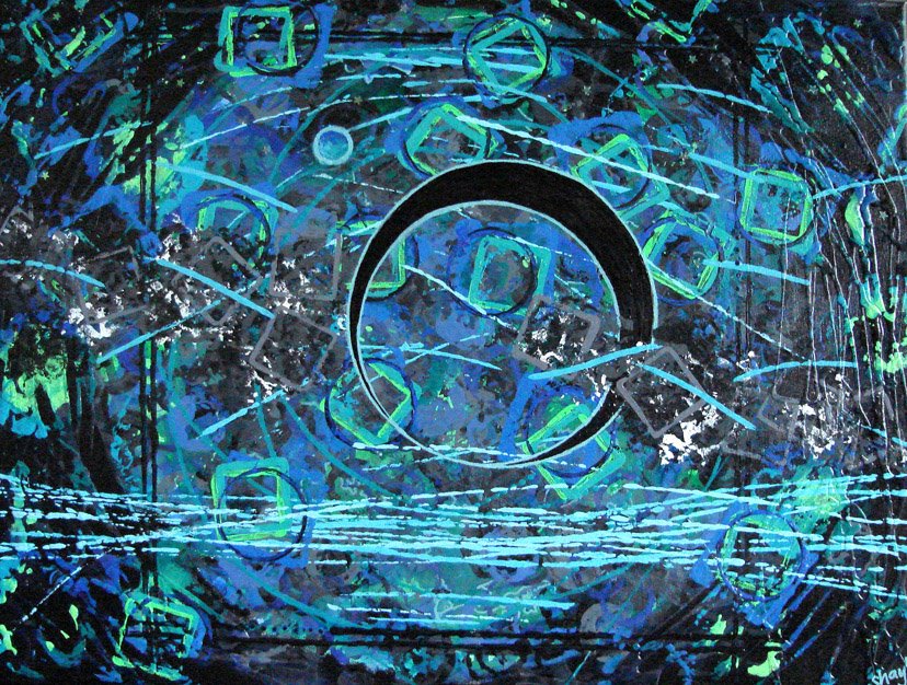
4. no light (glow)
2. uv and artificial lighting combined
3. uv lighting only
4. no light (glow)
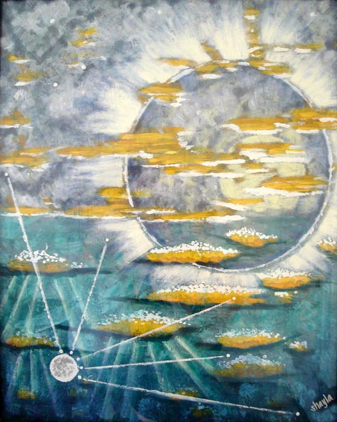
I broke the mold with this one. No, really, I mean the canvas separated from the wooden frame after I began painting it. After an emergency trip to purchase a staple gun, damage was kept to a minimum.
I wanted to paint something with entirely warm colors. I think this one is a response to my earlier painting, Rings. I wasn't trying to portray nature exactly, but more the interesting designs that can be made through using circles. I had all these visions of ancient coins and ancient buildings. I was thinking about feeling lucky, having all sorts of possibilities awaiting. Flip a coin, take a chance! My Grandpa used to collect coins, all different kinds, and we spent many hours examining them together. His collection was a treasure itself, but the memory of those many hours pouring through the different coins together is where the greatest treasure is. I am so fortunate to have that memory.
I wanted the blacklight painting to be very different from how it looks under normal lighting. You know how coins always have two sides, and those two sides are completely different? It's almost like two separate moods. It helps remind me that anything can change at any moment. You never know when your luck will turn around, right? Your destiny can lie within any new choice you make. I love that.
Avete trovato il vostro destino?